The Entryway Formula: How I Style a Minimalist, High-Impact First Impression
This post contains affiliate links. If you make a purchase through these links, I may earn a small commission at no extra cost to you.
We’ve all heard the cliché: you never get a second chance to make a first impression. But in interior design, this isn't just a catchy phrase, it’s environmental psychology.
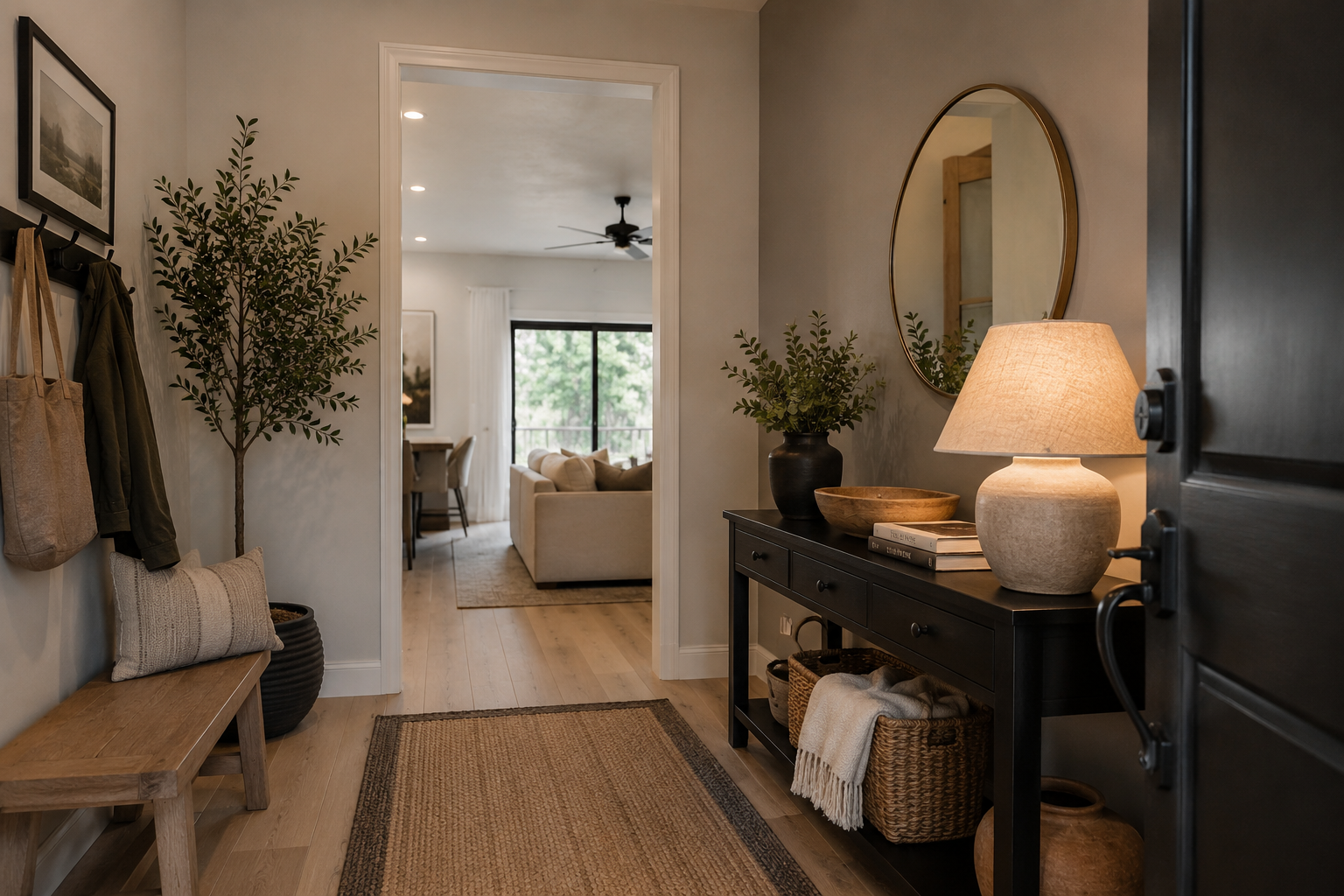
The entryway is the ultimate transitional space. It’s the buffer zone between the chaos of the outside world and the sanctuary of your home. Yet, so often, it becomes a chaotic dumping ground for keys, mail, and shoes.
Whenever I travel and check into a high-end boutique hotel or a meticulously curated Airbnb, I always study the entry. The best ones instantly shift your mood. They feel serene, deeply intentional, and sophisticated without being cluttered. When I’m styling my own home, I aim for that exact same "moody," elevated vibe, a space that feels clean but packed with personality.
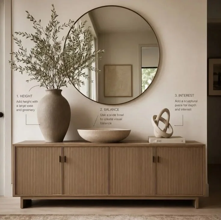
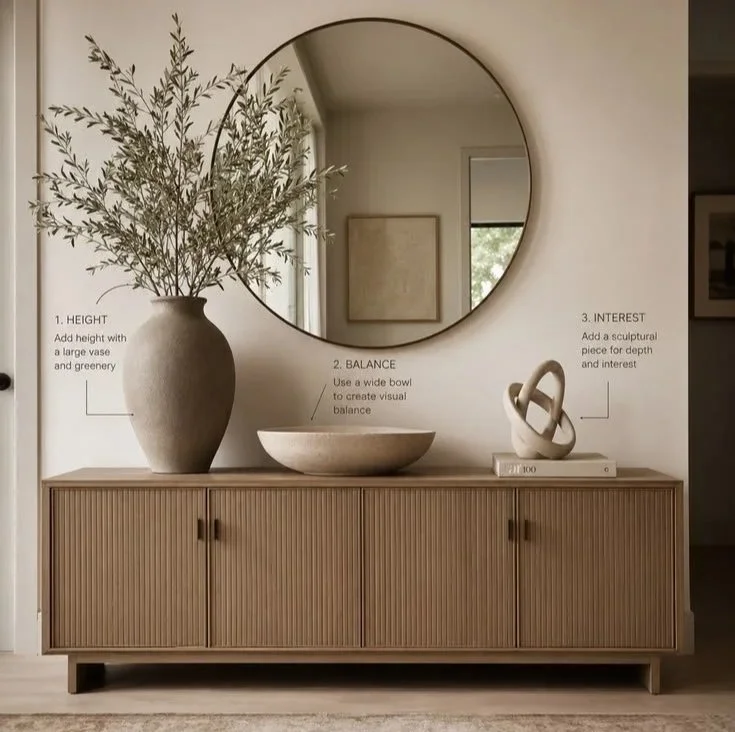
If you love a sophisticated, minimalist aesthetic but don't want your space to feel cold or empty, there is a simple math to getting it right. It’s what I call The Vignette Formula:
Here is exactly how I use this design equation to curate an organic modern entryway that feels incredibly premium, using the core facts of scale, texture, and human behavior.
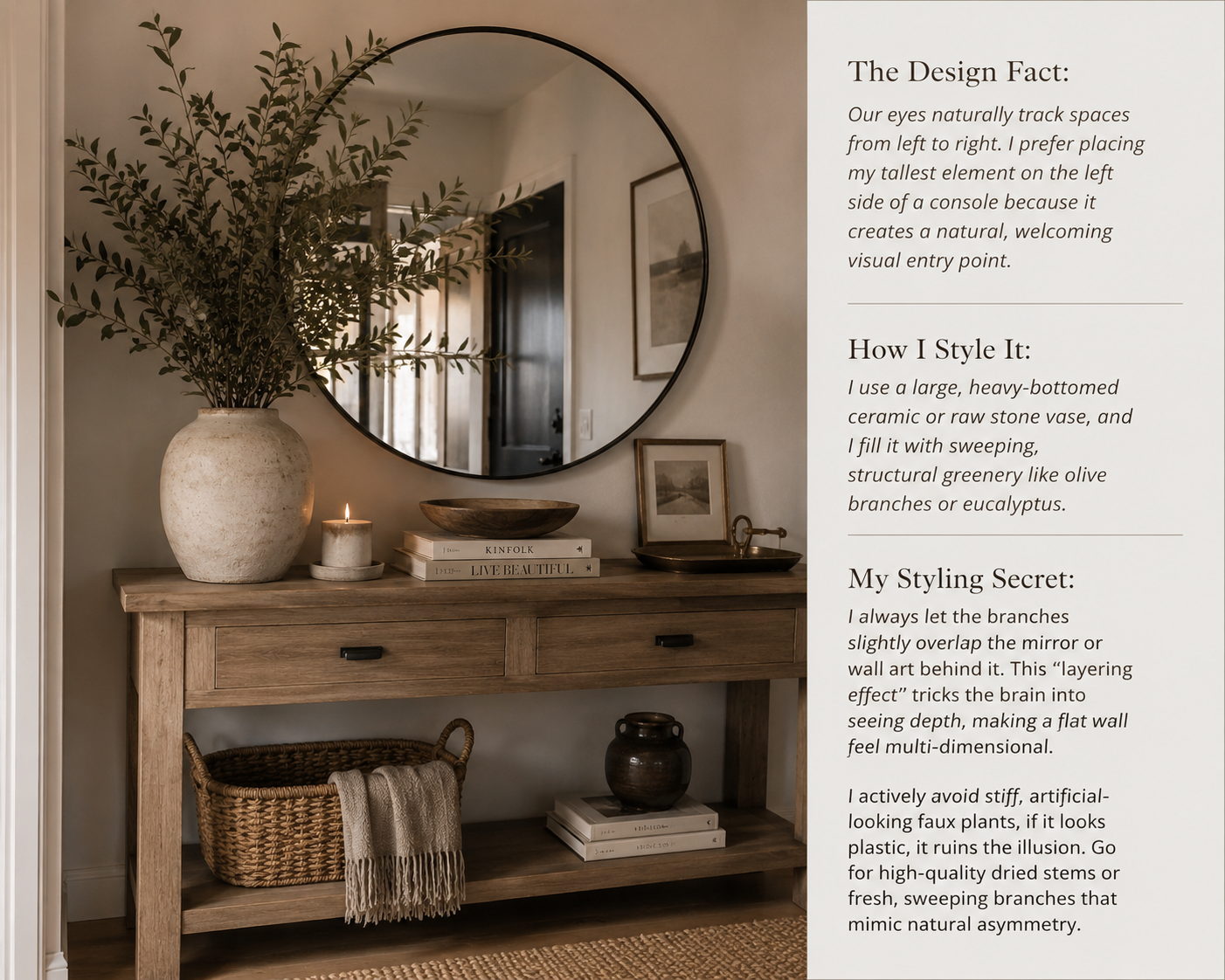
1. Establish Height: The Visual Anchor
Every successful vignette needs an anchor, an element that commands attention the moment the door opens. Without a tall object, a long console table or cabinet can feel flat and ungrounded.
My Top Pick for Height: I love using this Timeless Grace Vase because its rustic and oversized vintage look add instant drama without feeling cluttered.
2. Create Balance: The Low-Profile Weight
Once you have a towering element on one side, you need to ground the center. However, "balance" doesn't mean perfect symmetry. I find that symmetrical styling (like matching lamps on both sides) can feel rigid, traditional, or even a bit childish. Asymmetrical balance feels modern and curated.
The Material Fact: In a neutral or minimalist color palette, texture replaces color. To make a neutral space feel expensive rather than boring, you must mix your materials. If my cabinet features a smooth wood or a rich fluted texture, I love contrasting it with a rough, matte travertine or concrete bowl.
Function Meets Form: A wide, low-profile bowl acts as the perfect visual bridge. Behaviorally, it also satisfies our human need for a "drop zone." When I come home, I need a dedicated, intentional place to put my keys or sunglasses. A beautiful stone bowl keeps them contained so the rest of the surface stays pristine and uncluttered.
3. Inject Interest: The Sculptural Conversation Piece
The right side of your arrangement is where personality lives. To balance the height of the vase on the left, you need an object of medium height on the right that offers high visual intrigue. This is where I like to break away from standard catalog decor.
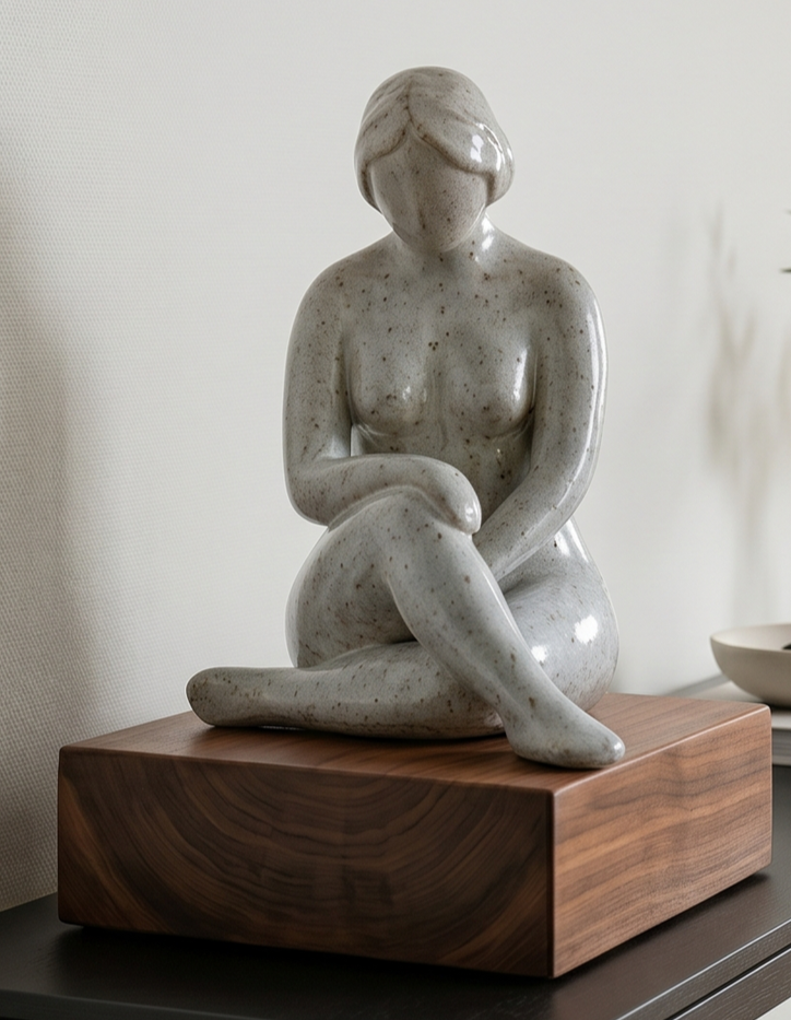
How I Style It: Introduce an abstract, organic sculpture, think interlocking geometric stone loops, or a striking historical artifact. For my personal taste, this is the perfect spot to feature a unique geological specimen, like a large, natural geode with distinct line patterns or a beautiful piece collected from travels abroad. It grounds the space in something real and worldly.
The Stacking Rule: I never let a small object float alone on a large cabinet; it ends up looking lost. Instead, I stack the sculptural piece on top of one or two oversized luxury design books. This adds instant visual weight and allows me to micro-adjust the height to perfectly balance the vase on the far left.
4. The Backdrop: The Geometry of a Round Mirror
Why do almost all top-tier boutique spaces feature a massive mirror in the entryway? It isn't just for a final outfit check before you leave the house.
The Spatial Fact: Mirrors reflect light into often-shadowy hallways, instantly doubling the perceived square footage of a narrow entry.
The Contrast Rule: I always look at the lines of the furniture. If your entry cabinet features hard, straight lines—or a rich, linear detail like fluted wood paneling—a sharp rectangular mirror can make the space feel boxy and aggressive. A large, thin-framed circular mirror breaks up the rigid lines, softening the entire vignette and drawing the eye inward.
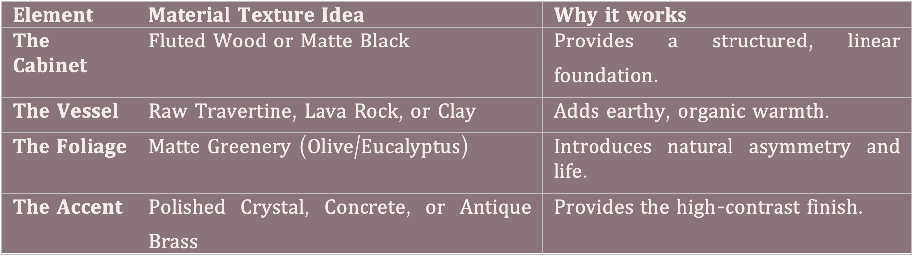
My Cheat-Sheet for Material Mixing:
To achieve that high-contrast, moody look, I always try to tick at least three of these textures in a single display:
Final Thoughts: The Art of Restraint
The secret to a sophisticated entryway isn’t what you add, it’s what you leave out. True organic minimalism relies on a clean, edited eye. By choosing just a few oversized, high-quality pieces rather than a dozen small knick-knacks, you create an environment that feels calm, intentional, and instantly grounded the second you step through the door.
